
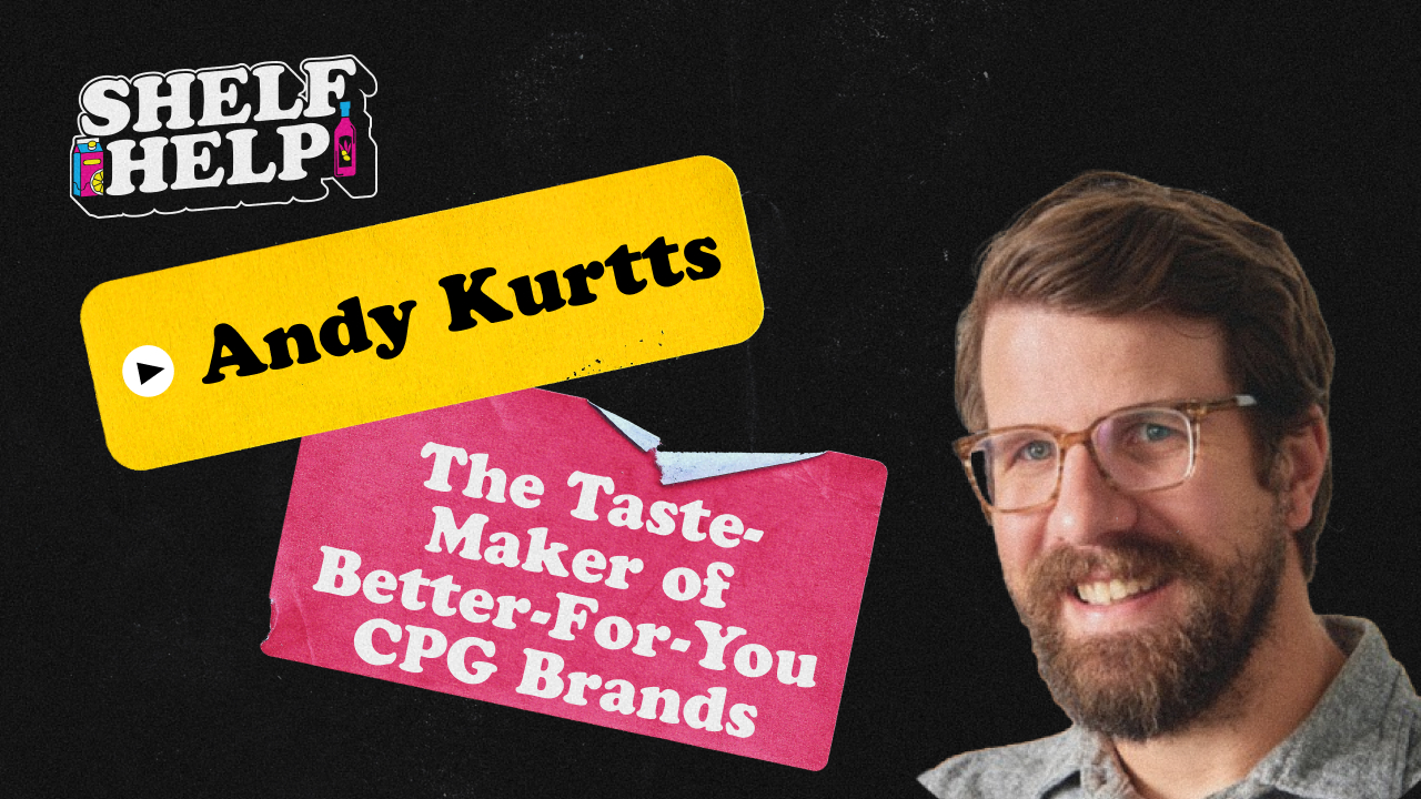
Andy Kurtts - The Taste-Maker of Better-For-You CPG Brands


.svg)

On this episode, we're joined by Andy Kurtts, Creative Director and Founder of Buttermilk Creative - the North Carolina-based CPG design firm behind some of the most recognized better-for-you brands on shelf.
Andy breaks down the most expensive packaging mistakes he sees founders make, specifically how RGB-to-CMYK color mismatches compound across substrates and SKUs, and why the nutrition facts panel is not the place to get creative.
We also get into the tension between designing for yourself vs. your target customer, why your logo probably isn't the most important thing on pack, and how hierarchy and clarity beat loud, busy design.
Andy walks through the Blue Zones Kitchen project, including the design sprint with multiple agencies, the handcrafted ceramic bowl that became the brand's most ownable asset, and why they're refreshing the packaging based on what they learned behind the freezer door.
We also cover DTC-to-retail packaging transitions, the debate around owning a color block on shelf vs. a rainbow approach, where AI is actually useful for design teams today, and the CPG trends Andy is tracking, including protein's staying power and how brands are visually tackling the dye removal movement.
---------------
Episode Highlights:
🛒 What retail buyers actually look for (hint: shelf-readiness over taste)
📦 Why back panel formatting can disqualify you before the tasting
🎨 The most expensive packaging mistake (RGB vs. CMYK color builds)
🖌️ Designing for your customer, not yourself
✨ Great packaging clarifies, it doesn't shout
🔤 Why your logo isn't the most important thing on pack
🧊 The Blue Zones Kitchen design sprint and freezer door lessons
🏺 The handcrafted ceramic bowl that became a brand asset
🌈 Owning a color block vs. the rainbow shelf approach
🤖 Where AI actually helps design teams (and where it doesn't)
👀 Trends: protein's staying power and the dye removal movement
---------------
Table of Contents:
00:00 – Intro
00:44 – Lessons from nearly a decade at The Fresh Market
03:30 – How retail buyers evaluate private brand packaging
06:12 – What buyers actually look for in new products
08:52 – Packaging deal breakers that disqualify brands
11:10 – Designing for your customer, not yourself
13:58 – Great packaging clarifies, it doesn't shout
15:54 – The most expensive packaging mistakes (color)
20:04 – Unconventional design inspiration (museums, art, global markets)
23:11 – DTC vs. retail packaging
27:01 – Hierarchy on pack and why your logo can be secondary
29:12 – The Blue Zones Kitchen design story
34:47 – Owning a color on shelf vs. the rainbow approach
38:07 – AI in packaging design
42:21 – CPG trends: protein and the dye removal movement
---------------
Links:
Buttermilk Creative – https://buttermilkcreative.com/
Follow Andy on LinkedIn – https://www.linkedin.com/in/andykurtts/
Follow me on LinkedIn – https://www.linkedin.com/in/adam-martin-steinberg/
For help with CPG production design - packaging and label design, product renders, POS assets, retail media assets, quick-turn sales and marketing assets and all the other work that bogs down creative teams - check out https://www.kitprint.co/
Episode Transcript
welcome to shelf help today we're speaking with andy kurtz founder and creative director at buttermilk creative the infamous north carolina based design firm founded i think in twenty fifteen works with some of the most well respected better for you cpg brands around so really excited to get into it i think annie just first question i had for you just i think i think you spent almost a decade as a design leader at on the retail side at the the fresh market before launching buttermilk to support brands i was kind of curious it's like what what were some of the key lessons that you learned and insights you gained being on the retail side for so long that maybe someone that only has spent time in the brand side might miss yeah yeah thanks adam thanks for having me on the pod and um i've you know seen seen the post on linkedin and i'm like i wanna i wanna talk to so so i'm glad we're fine so so yeah so i i think the so at the time when i started working at the fresh market i was just two years out of design school all my friends were working at really cool like cutting edge agencies doing cool work having a bar cart drive through the you know on fridays you know all the all the fun stuff and i was in north carolina working at a grocery store or you know at their corporate office and i was like what am i doing with my life and it you know it did in in obviously hindsight now i'm like that was the best experience i could have had based on the trajectory of my career um and yeah during that time we worked on my team worked on the in house magazine we worked on obviously store signage really anything that the marketing team needed support in store and some of that included the private brand packaging and that is really where i really like the every the dots started connecting and the way they worked similar to like trader joe's is that each project each product was a blank slate and so we really didn't have a line look there wasn't a even a consistent like place where you put the logo and so we just took that as you know creative freedom to to sort of explore different aesthetics different feels quickly learn that we also have someone we have to please which is the client which were the various buyers and merchants in in and cause that that's who would initiate the project and then those are the ones that we would have to get approval from along with the private brand director to to go to print and go on shell and you know in those meetings it was just fascinating you know we would the designers and i would like you know look at design blogs and find cool fonts and just you know try to create trendy stuff and cool stuff and the buyers would get it and they'd be like i don't get it what is this why are you why are you doing this i just i need this to stand out on shelf i need this to look like this i need you know look at the category look at the other brands on shelf they weren't necessarily saying make it look like that like a traditional private brand does but but just make it look like it belongs there and and so that was that was an interesting insight for me of like okay how do we balance this like standing out and like being having elements that the customer will be drawn to but then also not looking like you're totally out of place and like having the customer sort of like you know short circuit because like what's that doing there you know and like that that could mean that they go with something more familiar um and then you know just being in um that we we were lucky enough in their samplings and cuttings so you know when they would do category reviews they would have a whole bunch of products come into the office that was really cool because we would see how brands would send their stuff in some brands would do this you know a whole custom shipper um they would have you know all this nice material in there the products would be beautifully packed up others would just literally just throw it into a brown box send it off print out you know maybe print off some excel spreadsheets and you can guess which ones made it all the way to the buyer's desk and which ones were just sort of okay you know and just sort of like shuffled off to the side and so that was interesting cause it's like from when it hits the mail room to when it gets into the to the review that all of those touch points matter and and brands just you know being thoughtful of that but then seeing you going into the like it's like oh we're gonna go try a bunch of gelato and it was like oh yeah let's go and hearing them look at all these gelatos you know like there would be one that they would just they're just raving about this is the best thing i've ever had these folks have been to italy they know what it's supposed to taste like but it's like a tub with like a label on it you know and like the the the flavor like scrolled on it or you know maybe it's a a you know a label but it's not professionally designed and it's just sort of slapped on and then there was this other tub that's like it's okay it's not as good as that other stuff but it is in a printed you know carton it's ready to go on shelf it's got its upc it's got its nutrition facts formatted everything's ready to go you know that's the one they would pick and even though you know just because it's ready to go on shelf they didn't have the time and energy to coach a brand to get on shelf and so that was another thing it was like ok when i go out and do this on my own i'm gonna make sure our clients are ready to go from day one even if they're like no i'm dtc i don't wanna worry about that i'm not doing retail it's like nope we're gonna make sure you're ready to go you know you're gonna be formatted properly you're gonna have all the elements so that when you do hit shelves which you will eventually have to you will not have to hit any hurdles or anything you know just to get out there do you think about in terms of how retail buyers evaluate products that maybe just most like earlier stage brands kind of maybe either underestimate or just misunderstand it all yeah i mean i think you know a lot of times the there these brands don't the category manager the merchant always has to think about their set you know their planogram and the context of where that product is gonna sit and so you know you as the founder or you know also the designer really need to think about that as well even in the early stage even before you start designing you know you really have to know that category inside and you really need to know what are and and you need to know it from a i mean depending on the brand and depending on the type of product i would assume and the way we do it is we look at natural and conventional when we go start a new project even if it's like because nowadays like hyper you know funky natural product show up in you know like it's not like gluten free is only in whole foods or earth fare or the or the funky co op down the street it's their every really have to take all of that and plus you don't want to like pigeonhole your your your products or client into working with one particular retailer one particular channel and so you know really studying and learning all there is to to to know from a visual perspective cause you're assuming that they've done all the product development research flavors right products we're really just focused on looking at what are the opportunities what are the challenges of the set and in those variety of different landscapes and so i think that's how the the buyer looks at it too cause they really have to think about shelf space they've got to think about how many facings there's gonna be and so and then you know they're thinking about it from a visual perspective too so i think that's something that you know folks you know when when a designer usually present stuff generally it's beautiful on white background you know and sometimes we'll do a sort of competitive you know like line up but really you have to think about the noise of the grocery store and really trying to capture that when you're starting your research and then as you're iterating always dropping it in the photoshop dropping it in there and seeing how it's gonna look yeah that's a great point were there i guess looking back at at either that experience at the fresh market or just all the other products you've worked on and feedback you've heard that retailers give anything that comes to mind that's are like um specifically from a packaging perspective that's kind of like deal breakers for buyers that will just like instantly disqualify a brand from getting on the shelf regardless of how amazing the product tastes yeah yeah i i have to reiterate that the formatting aspect you know like the i mean you b c alone which that was sort of rare but still i mean you you would be you you probably wouldn't be shocked but some folks would be shocked to know that there people out there who have products have brands who don't know that you have to have a upc on it haha so true and and then the next is is uh is nutrition facts you have in ingredient statements and and then you know there's and there's the manufacturer distribution statement you know that back panel is so critical and you know there's not really much wiggle room there as far as what goes there and so you know buyers are aware of that they they can generally look at you know that kind of content make sure you know from that it's appropriate and then you know there that i think that really is the big stuff i mean yeah like there's the obvious stuff like a big pixelated image for your product haha the packaging um but or inappropriate images that aren't like part of your brand like a liquid death but but really it's really those those like devil in the details type of stuff you know where it's guidelines that you know really aren't i see sometimes designers try to get creative with the nutrition facts panel change the font do this change colors it's okay we wanted to look it on look like it's on brand but it's like no no no the minute that thing looks weird or different well first of all you'll get flagged by the fda but then also it it it potentially can erode some trust in the the customer why you know if all the big cpg companies you know you when you're looking at their nutrition facts panel yours should look just like that everybody trust them for better for worse so you as the small new brand new brand that no one knows you need to look the part too yep i've heard you talk about how i especially first time cbd founders often can often make the mistake of of designing their packaging for themselves rather than who the target customer is and and that's just really important for founders to just ask themselves um you know is this what the buyer shopper needs to see or is this what you like or not you know just in experience but it does the you know obviously the assumption is well i'm making this product i've discovered it or i came up with the idea and therefore it's my brand it's my baby therefore i don't like orange and so it's not gonna have orange i'm gonna never put orange anywhere and and despite the fact that you know let's just use me as an example i'm a you know forty something white dude with with a beard and i'm now developing you know a energy drink for teenagers you know female teenagers you know i just i hit on that formula and they love it and da da da like what what appeals to me mister beardio is not gonna appeal to that demographic so i really have to stop thinking about me as the the customer even though i'm the brand owner really have to think about really is gonna appeal to that demographic what what are the cues what are all the things not not me anymore i gotta take myself out of it and it that can be hard because it is you know it is a big business decision that you're sort of having to um to to be uncomfortable with but the best way to do that is to do the research is to trust that you have done that foundational brand work and you know who that demographic is and you have a good sort of idea of what would appeal to them from a visual standpoint and and you trust that that data and i mean when you have all that you can take some of that subjectivity out i think a lot of times founders sort of like will retreat into like a sort of defensive position or or you know sort of retreat to their own sort of like tastes and aesthetics when they're out of their depth or they're out of their element and as designers we sort of need to help them feel comfortable and feel like no you're making the right decision i know it doesn't it doesn't feel right but the data says that this is the right approach so you know that's that's sort of there's ways to get around it i mean if you're working with someone who is open to that that's and usually you know there there obviously there's founders of all different types of personalities but usually those that are open to it are the most successful good point building on that a little bit i think i've also heard you say in some somewhere or another that um great packaging doesn't need to shout it needs to clarify what do you mean by that yeah so it it you don't need to be the craziest loudest most bombastic on shelf you really need to you know say what your product what your brand is what your product is and you really need and if specifically if it's a food product you really need to wet the appetite of your customer you know and like really because that's what we eat with our eyes you know and that's really what's gonna draw them in and if you're let's say you know you have this amazing i don't know like a like a like a cake in it it looks so good when you make it and it's just like so decadent and it's just like oozing with like all this yummy stuff but you wanna put a cartoon character on there cause it's like oh this is for kids and it'll be cute and this that and the other you know it's like the that cartoon character isn't gonna necessarily draw people in like a beautiful piece of cake is going to draw so like that's there you go clarity it's like what's this product about oh that's a tasty piece of cake i'm gonna buy that it's like no is that a is that a toy in the cake aisle what is that is it a uh is it an action figure that they're trying to you know shelf over here so that's what i mean by you know just trying to strip away everything on your packaging and really clarify what are those two at the at most two or even maybe three call outs that really resonate with your target customer um and um and probably with the bigger trends going on at the time um and and really conveying that appetite appeal totally what have you found or some like the most expensive mistakes ec founders make before they get on shelf yeah i feel like color is sometimes a huge can be a huge you know learning curve for for for founders and and sometimes for designers too especially like emerging designers that maybe you know don't haven't worked in a lot of different print specs and you know what and and like this misunderstanding that what you see on screen is what's gonna be exactly what you see when it prints off i've had to literally hold up a swatch book you know like a like a colorbridge pantone swatch book to the camera and like show clients like i know you wanna print this particular color but this is what it looks like in cmyk and this is what it looks like as a spot color and it'll be certain colors are night and day and i and it and they just can't it's hard for them to wrap they're like but but i see it here why can't it just look why can't it just print out you know it's like i'm telling you it's just that this is this is printing and these are the the laws of printing and they do not move and so i think that that can you know you you invest all this time and energy and you do your run and you know hardly anybody does press checks anymore and so when it arrives at your loading dock or wherever your house your garage whatever and you unwrap that first box you're super excited like oh that what's that color and so that and that's like like i i think typos i mean yes there's certain things where like clients have had to add a little label to a mistake or something like that but generally stuff you can catch on the next print run you know and if you're smart especially with if you're a merging brand you know you really need to to max out those those minimum orders so cause you have to you have to assume even if you don't have any like like typos or any color issues you're gonna or or at least tweak your package learn when you're on shelf when you're first on shelf or first you know you're gonna learn okay next time we need to show protein on the front not low in sugar or whatever it is but yeah i that's what i would i would say is is the color issue and like we've had to go back into certain clients who have been out the world for a while they their portfolio grew over and as they started to see multiple products on show they realized that their design system was broke and like specifically their color was off even it's like it's it would be the same product but different format so you'd have a box bag and they would be wildly different colors now that kind there there is a little bit of difference between the you know there between material that can happen but this was beyond that and when i looked at the files i realized that the designer before me had created all the colors in rgb and so it was like okay we have to take a step back i need to audit all y'all's print processes and then we need to go back and actually pick pantone swatches for everything we had to rebuild so that was a very expensive you know mistake that just built over time five years ago they didn't realize that oh we're gonna have that particular product in a jar label or you know label and have it on box and it's not it's not like you know it's the worst thing in the world but it can be very disappointing when you're so excited about your packaging see it and it's like bleh ha ha cause yeah we've definitely seen it especially the color issue especially across to your point across like different like substrates and materials is like you can make it right on a box or can but then they also are printing a cell sheet and a shelf talker at a different printer and there's multiple printers or vendors involved that's where it seems like things can things can get a little hairy and and quite inconsistent if you're not careful for sure yep yep absolutely in terms of your process where you get inspiration from i've heard you talk about how sometimes you look to a few i would definitely call them some unconventional places for inspiration i think one of them being museums and in heart art history just kind of curious can you like think back to an example or two of things you've pulled from the museum or something our history that show up on a few products that we see on shelf today oh man um cause cause it's funny it's like cause you when you're looking for inspiration it's not a you know it's not a direct right of course and so i mean i can think of like so like we one of our clients my better batch she does cookie mixes and she has this like the way we designed it it's like it's like a teal background like a bright pop of color and then the cookie is front you know right there on a large on the the front of pack and that always makes me think like i know that we had pulled some like pop art references to sort of look at for for that particular packaging and and you know it's i didn't do any kind of like half tone dots like a roy lichtenstein type of like homage or anything or even andy warhol type of thing but it's still i know that like from a color perspective from yeah it was almost like pop art ran through like a nineties filter because of the teal and the pinks that we used we're felt sort of nineties so you like grasping for straws here but yeah like i just think i think whether it's subconscious or whether it's like directly goes onto a mood board the more designers get out in the world and and and look at and be exposed to as many types of types of stimulus as you can you know and like broadway shows or you know whatever all types of stuff or just obviously walking around but i mean but then also you know all different types of grocery store there's two are also great you know whether it's your your sort of global market we're lucky and here in greensboro we have something called a super g mart and it's just like this huge global market that has all different types of international products and it's so cool and find tons of inspiration there so so yeah yeah like i just i think if we're all sort of looking referencing like the coolest design or the coolest product the award winning products then obviously it's all gonna start looking the same i mean it already some of it does feel that way and so and you know when you're drawing inspiration from these unconventional places you don't ever have to worry about oh did i rip that typography off of you know that prada or yves saint laurent's work or whatever right i'm always worried about that i'm always like oh god did it i hope this inspiration came from somewhere it's like that's almost too good did it did that come from someone else we doubt ourselves yeah totally wanna talk about ddc versus retail when it comes to packaging and i guess for brands that that start on the ddc channel i think it's pretty common these days been used to kind of having the luxury of telling their full story across their website you know various ads whatever their funnel looks like and but by the time the customer actually hits that product detail page in the website with all the images the packaging etcetera the brand has already kind of had the chance to tell that brand story but you know when they transition to retail they don't really have that luxury it's like for many consumers first time they see the brand on the is is when they're walking down the aisle and they see it on the shelf and that's the first time they encounter the brand and they just need to be able to kind of get the brand story in that that kind of typical whatever three to five second rule and what it stands for in a matter of seconds if they want sale and i'm kind of curious and how do you kind of think about the and i kind of approach the different environments of ddc versus retail and how they impact packaging design to making sure that you're covering all the bases if that makes sense yeah um it is and it's so it's everything is so intertwined everything is so dependent on each other and you know like you with for instance when you do go into retail a great way to help your you know your people become familiar with your brand is through sampling you know and so like that has nothing to do with your packaging i mean it's it can conversation starter you know if you have your display table you know and you've got your stuff there and people are like wow that's that looks cool i'll try it but it truly is that trial you know where people are getting to try it it can be the biggest you know that can benefit things greatly over just like a cool looking package that never gets tried but um but yeah it's it really i think for me it really comes down to making sure everything is consistent and you really have thought about and thought through this whole brand universe that you're beginning to create and and it's really intentional and it's all just so well thought out you know whether it's um you know all your thumbnails on your um product pages and and the the like the elements that are included there to in any kind of like signage in store it's all consistent your social media all that kind of stuff but yeah it's it's so it like the hope is is that if you've done it the right way and there's plenty of models out there and plenty of people to look to for inspiration and as like a framework is that if you start ddc and you sort of do the things the right way you build the buzz you build your community you do all that kind of stuff then hopefully you know by the time it gets to the buyer and like all the like numbers match up and all that kind of stuff you're ready to go on shelf because your community has been asking i want i wanna i wanna buy this in store i wanna buy this in store and then when it shows up in store you know you sort of have that sort of built in community there ready to to buy your stuff they're already familiar with it like they don't eat but but then obviously when you know there's a ton of people who don't know about you and so that's when those other sort of like tactics sort of come into play but but yeah hopefully you've sort of built that really good of community you find ready to go but yeah for me it's consistency like just make sure it's all looks intentional and nothing looks half hazard and like you know like oh no we have to throw together this shelf talker in in an hour to send to the retailer holy yep i i know that story i definitely know that story hierarchy is one of the things that can be misunderstood and arc and or just kind of an ambiguous part of packaging design but is a super important part how do you think about i guess approach and think about hierarchy and why do you if you agree like why do you think it's can be so misunderstood well i think it's misunderstood because especially with like smaller emerging brands or maybe sometimes brands in general is that often times especially within the three to five seconds or one to three seconds or whatever your metric is the brand often times isn't like your brand your logo isn't the most important thing on that packaging it's really what is compelling and what is gonna draw people in from like a visual perspective and you know whether it's your product photography that's like looks so yummy or it's some kind of message or call out that speaks to me directly like wow that's twenty one grams of protein that's amazing i need that and and really outside of like coca cola and apple and pepsi i mean no one really is gonna know your brand name you know and so or or recognize your logo so but that's often times seen as like wanting to be the most important thing on the package and it really can be secondary sometimes even tertiary and you can you can level that out over time so that you know as you redesign or as you refresh your logo can get a little bigger cause obviously you do wanna sort of have name recognition but but it's also just not your logo it's the whole look and feel but yeah you really have to hit on really your differentiators your call outs your as being some of the most important thing and then um product product flavor name that kind of stuff and then your visuals really that's what you're trying to really drive home in less of like this is my full logo that i want to put really big on package right totally yep i resonate with that too hahaha i had scott marcus from blue zones kitchen on the pod a while back i know buttermilk you guys did the the the design work for for that to the brand which which looks awesome tell me just a bit about how that approach what that approach look like for this project especially kind of taking into account that it's in the frozen section which i feel like has some i don't know unique variables or challenges to take into account absolutely yeah that was a yes that was a that was a really fun project and really like how you we went on so many different routes to try and convey this sort of like concept of you know sort of global flavors a sense of place you know between the different blue zones and um and actually we also the the original design which we're actually we're we're in the process of refreshing cause we've learned like i said like we've learned that certain things aren't working behind the freezer door so we've we've actually refreshed it and those should be rolling out you know and like q three i guess or q two of of twenty twenty six but what where we landed was interesting worked with um i we we did this different approach where we did a design sprint so as creative director design sprint with multiple agencies and cause we were like what let's just sort of put it call out there and see where all these disparate sort of concepts and ideas might fall yeah and it was and that was driven by the the the blue zones team sort of like wanting you know they were already it sort of fit in with like their model of how they were sourcing ingredients they were finding ingredients from all like the best ingredients from all over so it was like okay let's sort of try that with with our design and and so um where we landed the design was um the the uh studio is called group chat and they um did an awesome job sort of editorializing the design and like sort of creating something because dan buettner's background the blue zones founder his background is in at from national geographic so very editorial sort of like looking approach and so it made sense and so once we once we started finessing and looking at that layout it was like okay this is it and and also it was like there's not really anything else with using this like bowl overhead i mean there's obviously lots of brands that do overhead photography it's hard to stand out you know in the freezer section it's hard to be different but from our perspective we weren't really seeing anybody with this like very subdued very subtle just like pop of color bowl in a in this like subtle field of color with minimal call out and and that has served the brand well and it's become pretty iconic but we have learned that we do need to throw some color and we do need to pull up just because of shelf certain placements we need to pull the content higher up so that the flavor you know little tweaks but but yeah it's it's exciting that we all we launched with a great design and then we an ownable design and we've only made it better but the other cool thing about that and i'll try to be quick about this is that that blue loop that is featured on every blue zones blue zones uh a package is was from so let's see it's a it's an artist and i'm gonna totally space on his name his first name is ibrahim but he's an egyptian ceramist who lives in greensboro okay he is a friend of the food photographer our food photographer is don raje manuel and so don rosh when when i was talking with don rosh about how we wanna shoot the product and you know our thoughts behind it he was like i wanna talk to my friend ibrahim and have him create a bowl a blue bowl for this project and so we commissioned him to do it and it has now become like one of the big brand ownable brand assets we even have a special pelican case for it that we that's not in when we're not shooting so critical that like that that particular blue you know the the glaze that he used just every everything about it collect for us and it's just like the customer doesn't know that that ball was handcrafted but we do you know and i think subconsciously that sort of meaning comes through and then it also is a symbolism of how the meals are the like just the meals were handcrafted the recipe and then how that then ties into blue zones and like the the the the whole like philosophy behind working with your hands and gardening you know just it just is a whole like a whole thing comes full circle and um i think that's a sort of cool thing about like when you really can infuse a lot of meaning into your packaging that and go the extra mile even if people don't can't understand that right away when they look at it from a freezer door it still because it has that meaning it does stand out the concept of owning a color it seems like you know historically that's kind of been considered the typical strategy by many meaning it seems you know you have you add more skews onto your on your products we looking on the shelf it's like you're owning kind of a color block but it seems like kind of contrary to what you see a lot of brands doing today in market where it seems like it's a bit more of kind of like a you know as they get more products on the shelf it starts to look a bit more like a rainbow rather than one solid color and i'm kind of curious from from your perspective i mean this is like swirling your world like is i guess one is is owning a color important and then if so why do you think industry to at least to a certain extent has gone the other way as of late yeah i mean i think it can always be it's all it should all brand appropriate so like we've definitely had clients who are like want to have a we'll explore rainbow you know with four or five products on shelf but um but we also want to see an option that has you know a a a um continuous brand block of color and because from their perspective that's how you build recognition that's how you sort of create this like visual recall and if you're if everything's a different color then it's hard to remember oh i'm i need i wanna buy this particular brand on shelf and now i can't find it cause there's all these different colors but then other folks are like no i i want everything to be different and you know the logo will keep it together you know and so it really i don't really fall either way on it i mean i do like friends with and and in the in like a situation like the blue zones like their sort of system is obviously the blue bowl with the product in it and so that's that's always gonna be there that's critical and then they have this sort of muted colors in the background and so even though they're different they're still muted but then they also are categorized by different regions so it's not like every single product has a different color it's like their groupings where like the the the meals from latin inspired by latin america are sort of this like tan color yeah and you know so on and so forth so you know i really think it's comes as long as the thought has been put into it i think that's more of the issue is like if you just haphazardly were like right i wanna yeah i just kept adding flavors and i just wanted you know you'd see a lot a lot of like brands that just didn't have that that thought for thought to like build out their five year plan you know and they just kept adding flavors and you know oh we just pick colors you know and whatever but then i also think that you know yeah like this like sort of idea of like a coca cola red or something like that that being like what you hang your hat on just really relevant anymore and really i guess nowadays you know brands have to work so much harder to to get noticed and to you know get recognition and and so it really you can't just sort of like hang that on a color anymore it's gotta be part of the whole ecosystem when it comes to ai what's um what's your take on like the state of ai when it comes to the design world and in cpg specifically yeah i guess like where where do you feel like it's it's actually helping packaging design teams today and on the other side where do you feel like it's not even close to there i think in the way we use it is it's beyond helpful for research and and analysis and of being that partner to that's like strategic partner to like put our assumptions put our insights in our thoughts and then having some counterpoints or some additional thoughts you know like like hey chat i'm looking at this this shelf set this is what i'm seeing this is what i'm thinking this is how i might approach it and then you know it feeding back you know yeah that's good but also there's x y and z and so we use it a lot for that and to like just look at you know really like take a step back and figure out what are the things we're not seeing based on information we always put information in we try to never just like you just blow give me an idea you know like without it so that that not even i mean obviously we're using the visual of the shelf set but we're not really like generating visuals we're not really doing that and then um and then also just like as you can tell from this podcast i am very wordy i talk a lot i ramble i go on tangents so oftentimes before ai that's how our presentations were and it would be this like just like you know look inside like a like a madman sort of like strings everywhere and so what i do now is i will run whether it's you know it's something as simple as an email where i'm trying to explain a very complicated print process to a client why we can't achieve what we're trying to do or you know just having ensuring that i hit all the feedback points you know for for for for work or you know for another another round or even yeah like just clear finding my thoughts before i put them into a presentation that it's very nice and also call notes like recording calls that save my but so many times when whereas before you know that's that's great i think um you know where i wish it did a better job was i mean for instance the other day i had jpeg like scale down jpeg dialine or some boxes we were ship we were working and i was i wanna see if i can create a dial in from this and it just did not didn't do it and i'm just not familiar i'm like i also have this like i don't wanna spend a ton of time doing something that i know i could do really quick in illustrator you know like and so i spent a fraction of the time just trying to do it in chat and it didn't work i had to sit there and scale it so like that was frustrating cause it was like you know designers even if there's not a tool in within adobe that you know like that would be cool to like generate a dialine x y and z but yeah i'm i think i'm i sort of i definitely hear a lot of designers you know being raising red flags and saying like whoa this generative ai stuff is scary and like we shouldn't be using it we're sort of like we're gonna feed everything into the model and then we're gonna be out of a job but i really i'm not so scared about that i think you know as long as cause you know really it's clients hire us not because we use ai sometimes or we're more creative than you know like they hire us because they like our they do not done and all yeah not all you know they we we collaborate well all that kind of stuff so that's gonna be hard for ai to replace at least in hopefully in my lifetime last question for you andy any um you're just plugged into the space so many different categories and verticals any specific particular trends in the cpg world that particularly caught your eye lately or things you're you're especially tracking more than others i it definitely i'm interested i think it's interesting how much the the whole protein thing has been so entrenched and like even like a like we're not a protein heavy family but like my wife came home yesterday with like a clear protein like powder that like you know and it was like wow like this is this is not it's it's just infusing everything and i really didn't think that was gonna happen it's like we're gonna proteins a flash in pan it's gonna just sort of go out but it has it's it's a thing and it's gonna stick around but then obviously like you know you've got to balance that with fiber so it'll be interesting to see how people sort of balance the messaging around that and then it's been funny watching a lot of the how various companies are tackling removing dyes from their their products with the big cp and it's been funny to sort of see like how they they literally translate that into their packaging where they like they like create like not black and white but like almost like grayscale packaging yeah the the doritos packaging i saw that one that's one that jumps out the most yeah and so i'm i'm curious how as that starts to get out there like how other you know brands are gonna tackle that how they're gonna show that they're they're they're taking that action beyond just you know saying it how they're gonna so yeah that's that's sort of off top of my head sort of the things yeah those are both top of mind for me too for sure yeah well yeah this has been awesome really appreciate the time so many great insights here what's the best place for people to kind of fall along with with every all your expertise and then any plus place to fall along with work barter milk is doing yeah yeah you can um please connect with me on linkedin that's probably where i spend most of my time virtually you just find me andy curts and um connect with me there you obviously can go visit buttermilk creative dot com even be redesigned haha um which is on our list for twenty twenty six but and then at any upcoming shows you know we'll be making the rounds on all the all the regular ones awesome sounds good and you're listening great appreciate the time i think that's uh the call ah thank you so much adam for having me on and yes great conversation lovely to talk likewise